Data Visualization - Advanced
Common Data Visualization Mistakes
1. Misleading color contrast
Although using various colors aids in interpreting data visualizations, too much color can confuse the user.
It’s crucial to stick to a limited number of unique colors.
- Solution
- The simplest way to determine contrast value is to compare contrast colors on greyscale to check if the color you choose displays the difference.
- The simplest way to determine contrast value is to compare contrast colors on greyscale to check if the color you choose displays the difference.
2. Overwhelming charts with too much data
- Solution
- Do not put all of your insights into a chart. Multiple visualizations can help you communicate data more effectively.
- It is recommended that no more than 5–6 colors be used in a single visualization.
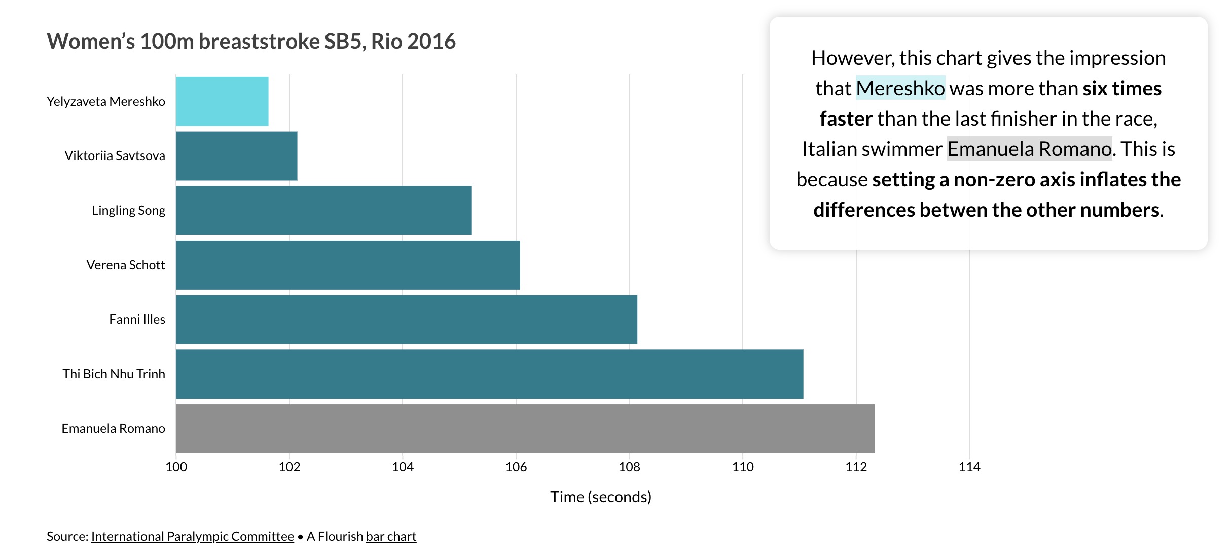
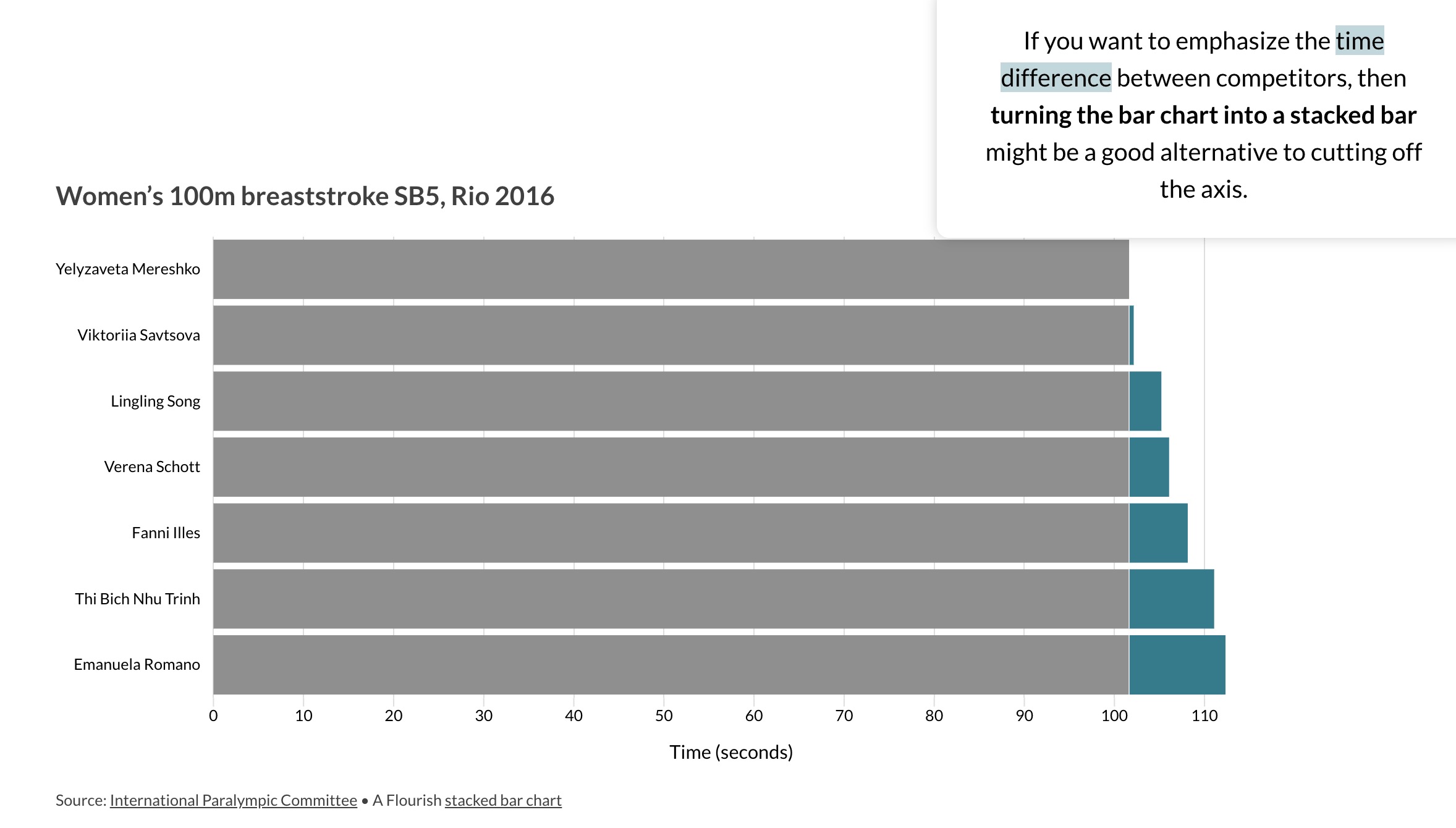
3. Omitting baseline and truncating scale

- Solution
- Concentrate on creating data visualizations with a zero-baseline y-axis.
- If removing the zero makes sense, add a zero-break to communicate that.

References
- Four data visualization mistakes you’re probably making and how to fix them
- Numbers Shouldn’t Lie: An Overview of Common Data Visualization Mistakes
- How to Choose the Right Data Visualization
- Tutorial 4: An Introduction to Data Visualization

