Data Visualization - Basics
What is data visualization?
Definition
Data visualization (資料視覺化) is the graphical or visual representation of data.
It helps to highlight the most useful insights from a dataset, making it easier to spot trends, patterns, outliers, and correlations.
Two main types of data visualization
1. Exploration
Exploration takes place while you’re still analyzing the data.
- When faced with a new dataset, one of the first things you’ll do!
- It helps you figure out what’s in your data.
- Get a sense of what’s in your dataset and to spot any noteworthy trends or anomalies.
- Finding clues as to what the data might be trying to tell you.
2. Explanation
Explanatory visualization helps you to communicate what you’ve found.
- Once you’ve conducted your analysis and have figured out what the data is telling you, you’ll want to share these insights with others.
- Help you tell the story, and it’s up to you to determine which visualizations will help you to do so most effectively.
Five types of data visualization
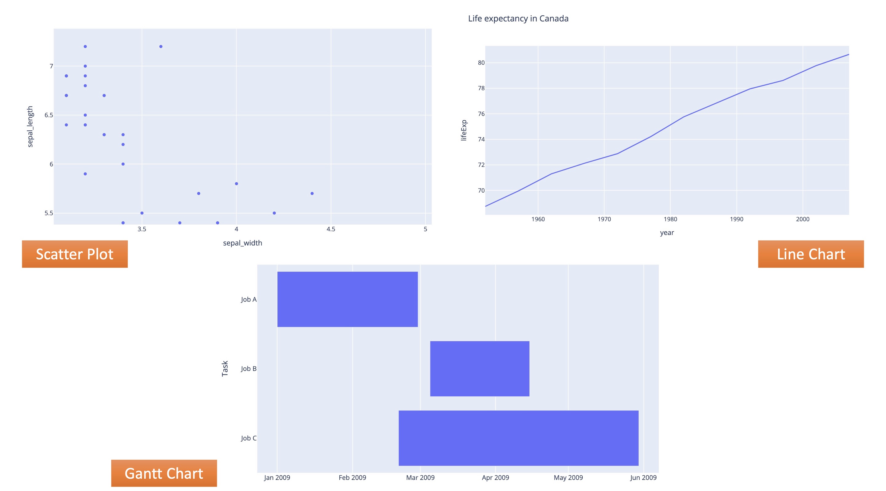
1. Temporal data visualizations
- Linear and one-dimensional
- e.g. scatterplots, timelines, line graphs
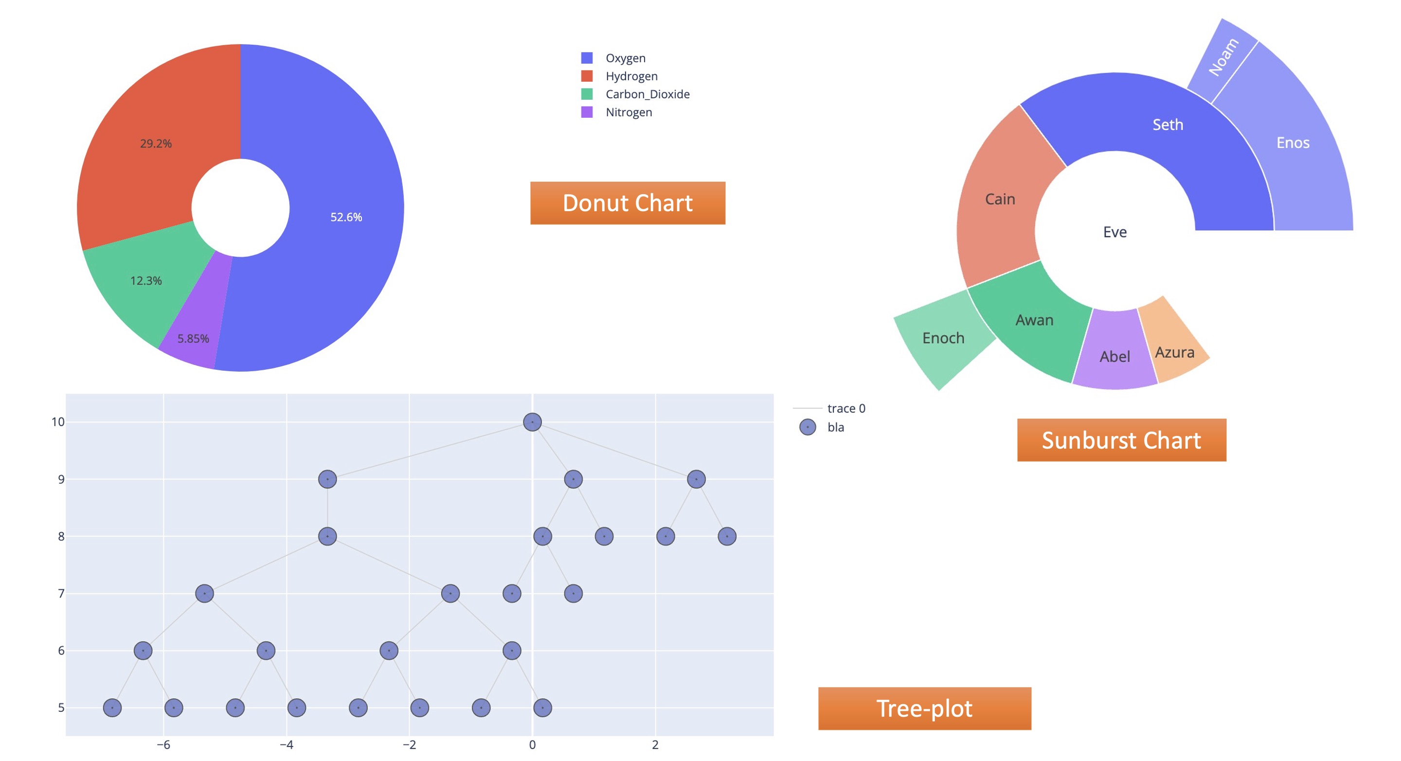
2. Hierarchical visualizations
- Organize groups within larger groups
- Often used to display clusters of information
- e.g. tree diagrams, ring charts, sunburst diagrams
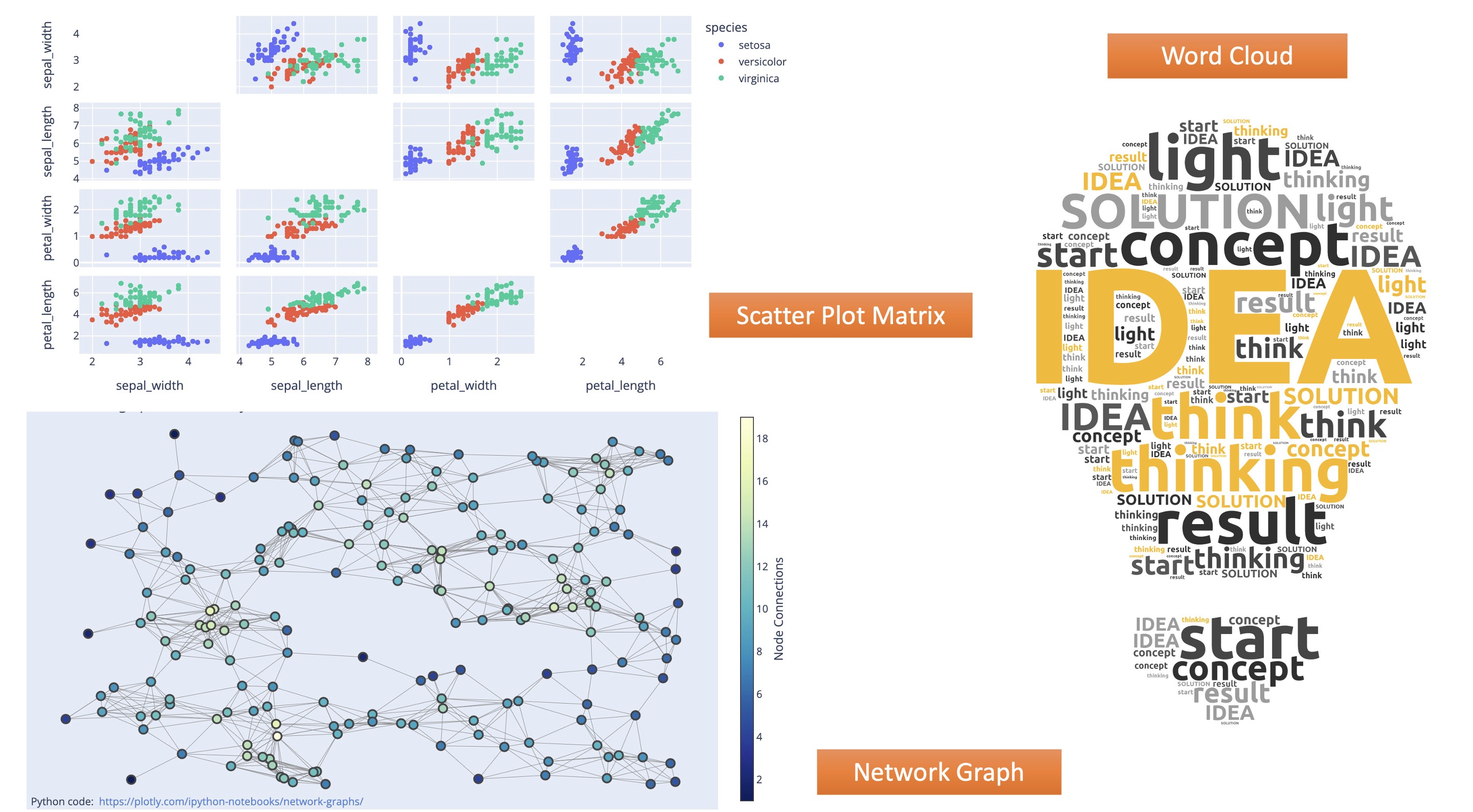
3. Network visualizations
- Show the relationships and connections between multiple datasets
- e.g. matrix charts, word clouds, node-link diagrams
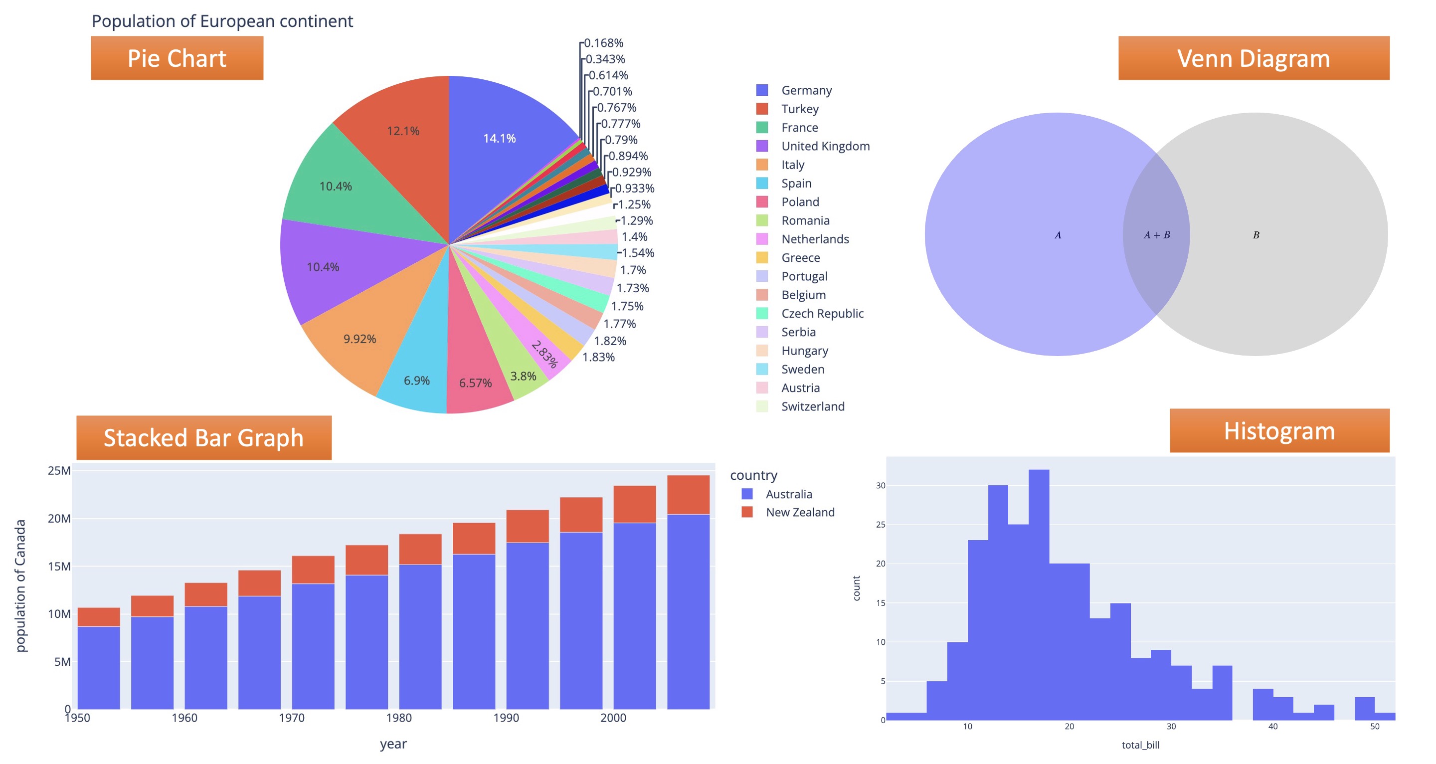
4. Multidimensional or 3D visualizations
- Depict two or more variables
- e.g. pie charts, Venn diagrams, stacked bar graphs, histograms
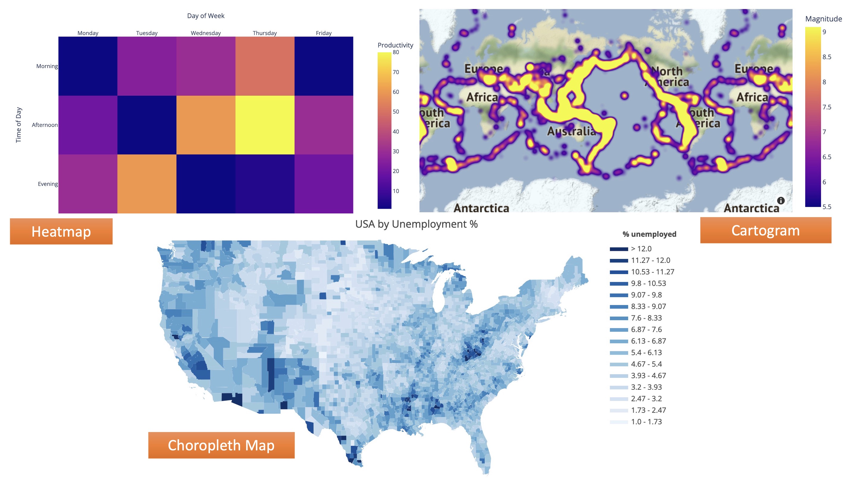
5. Geospatial visualizations
- Convey various data points in relation to physical, real-world locations
- e.g. heat maps, cartograms, density maps
Popular Python Libraries For Data Visualization
Matplotlib
Matplotlib is an easy-to-use Python library for data visualization which is built on top of NumPy arrays.
It is a low-level module and provides a lot of flexibility but at the cost of writing more code.
Seaborn
Seaborn is a high-level library built on the top of Matplotlib which means that it can also use Matplotlib functions and classes.
This library provides default styles and color palettes to make a plot more attractive.
Plotly
Plotly has hover tool capabilities that allow us to detect any outliers or anomalies in a large number of data points.
It is visually attractive that can be accepted by a wide range of audiences.
It allows us for the endless customization of our graphs that makes our plot more meaningful and understandable for others.
Other Popular Python Libraries
- Altair
- Bokeh
- Folium
- Diagrams
- Wordcloud
- …
References
- What Is Data Visualization and Why Is It Important? A Complete Introduction
- Python – Data visualization tutorial

